- 家具選びのポイント
Introducing the key points of monochrome interior design with examples
When you think of Scandinavian interior design, many may imagine warm colors and soft tones, but did you know that in fact there are many simple, sophisticated designs in monotone colors? Recently, " Japandi " , a mix of Scandinavian and Japanese styles , has been gaining attention, and Scandinavian interior design with minimalist, calm colors that also blends well with Japanese tastes is gaining popularity in Japan.
So this time, we will introduce you to "monochrome interior", which actually has a high affinity with Nordic style.
What is monochrome interior?

Monotone interiors are interior spaces coordinated with monotone colors based on white, gray, and black. This style is often seen in Scandinavia due to its simple and sophisticated impression. One of its characteristics is that the color scheme is simple, so the materials stand out even more. It is a typical Scandinavian interior style that focuses not only on appearance, but also on the texture of the interior, such as the feel and the shadows created by the light. The neutral atmosphere is also popular with both men and women.
The appeal of monochrome interiors
Easy to coordinate
When we ask for advice on interior design, we are often asked about color matching, such as "What colors should I match with the floor and wall colors?" Monotone interiors, which do not combine a variety of colors but instead use monotone colors of white, gray, and black as the base, are said to be an easy-to-coordinate style. Even if you are not confident in choosing interiors, we recommend this style because you can enjoy coordinating your interior design with peace of mind.
Texture stands out
Monotone interiors are simple in color, such as white, gray, and black, so textures stand out. The simplicity of color makes the difference between materials such as wood, fabric, and semi-lacquer, and textures such as rough and smooth, stand out even more. Many Scandinavian items are particular about not only design but also materials, so they go well with monotone interiors.
Can be used for a long time without getting bored
One of the attractions of monochrome interiors is that the base color is simple, so you can use it for a long time without getting bored. Items from Scandinavia are characterized by their timeless design that can be used for generations, in addition to the aforementioned "attention to materials." From a sustainable perspective, such as continuing to use the same furniture for a long time, monochrome Scandinavian interiors are items that we would like to recommend.
How to Choose the Right Monotone Interior

Stick to texture
Monotone interiors have a simple color scheme, so they can end up looking flat and monotonous. The key to this is to focus on texture. As mentioned above, texture stands out in monotone interiors. By choosing items with as many different textures and textures as possible, you can create a space with depth even in the same tone.
Use monochrome on floors and walls
Floors and walls, which take up a large area of space in a room, have a big impact on the impression of the space. For example, by incorporating items that cover the floor, such as rugs, you can easily change the floor color to a monotone look, even if it is a set floor color. For walls, you can choose monotone colors for curtains, posters, and art, or incorporate monotone interiors with wall-mounted storage, which is popular in Scandinavia. Making use of walls in particular is recommended for people living alone or for those who "have a small room and cannot fit much furniture."
Consider the color scheme
Monotone interiors with a small number of colors are easy to coordinate, but by knowing the characteristics of each color before combining them, you can create a more comfortable space. Because there are fewer colors, you should be conscious of using each color effectively.
Monotone color scheme
white
White, which gives an impression of simple sophistication, is one of the most popular colors. It reflects light well and brightens the space, so it is popular in Northern Europe where the sunlight hours are short, and is also recommended for rooms with few windows. It is also characterized by its ability to easily see shadows, making it easy to see the difference in texture, such as smooth and rough. By combining various materials, you can create a space with more depth. White also gives an impression of cleanliness, so it is recommended to use it in areas around water such as kitchens and washrooms.
gray
Gray blends easily into any space and is easy to balance with other interior items, so it's a color that even beginners to interior design or those who are having trouble choosing a color can choose with confidence. It's not as noticeable as white or black, so it's recommended for furniture with a large surface area, such as sofas, or furniture that you want to use for a long time without getting bored. It gently connects black and white interior items like a gradation, so it also plays a role in unifying the space.
black
Black is a color that tightens up a space. White or gray alone can give a monotonous impression, but adding black will give the space more definition. Also, if you use black as the base color, it will give a more chic impression. Since furniture with a large surface area can easily give a feeling of oppression, it is recommended to choose delicate designs or items with a low center of gravity such as sofa seats and rugs.
Greenwich's recommended monotone furniture
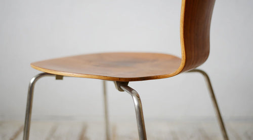
J80 (FDB Möbler)

The J80 from FDB Möbler has a timeless and modern look and is used in restaurants. The flat and wide seat is stable and comfortable in any position, making it the perfect chair for long periods of time. The version with a black frame and paper cord is also recommended for monochromatic interiors. Even though the chair itself is black, the spoke back and paper cord material of the backrest give a light impression and reduce the feeling of oppression.
String system White(String)

String is a wall-mounted storage product made in Sweden. White is the most popular color not only in Japan but also in Sweden, the country of origin. You can enjoy the difference in texture between the glossy frame and the matte textured shelves. The frame is also delicate and airy, so even if it fills an entire wall, it doesn't feel oppressive and makes the space look spacious. This storage product makes use of the wall, so it is also recommended for space saving.
Brutus Lounge Chair(101COPENHAGEN)

101COPENHAGEN is a brand from Denmark. Their items are designed with the essence of the Japanese concept of "wabi-sabi" and feature minimalist and subdued color schemes, making them the perfect brand for monochrome interiors. The solid and heavy Brutus Lounge Chair has a bold design and just one piece can create a monochrome space.
Greenwich's recommended monochrome items
Cobra series (101COPENHAGEN)

101COPENHAGEN interior accessories, like their furniture, are characterized by a design that feels like a fusion of Scandinavia and Japan. The flower vase, with its calm tones and texture, is an item that can be enjoyed by arranging flowers in it or simply displaying it as an object. The Cobra series, which has a human silhouette motif, comes in a wide variety of sizes and designs, making it a beautiful item.
String Museum White (String)

This side table was designed by String , a wall-mounted storage company, in collaboration with a design firm. The top is movable, so you can freely change the height to suit the occasion. The delicate design adds a nice accent to the space. The aluminum and steel materials used give the space a more high-quality impression.
SNOW DROP Floor Lamp (LE KLINT)

The SNOW DROP floor lamp is a popular item from LE KLINT , a leading Danish lighting brand . The delicate stand is made of black steel and the beautifully shaped shade is made of white plastic, so you can enjoy combining colors and materials. This item allows you to easily incorporate a monotone taste into your look.
Introducing examples of monochrome interiors by scene
living

A living room scene centered around a pale grey sofa. By choosing a grey that blends easily into the space, the room gives a spacious impression without feeling oppressive, even though it is large in size. A glossy grey is used for the living room table, with a different texture from the sofa to create a sense of depth. Additionally, white pendant lighting adds brightness to the space. A space that would have been monotonous with just grey has been transformed into a sophisticated monotone space by combining different textures and adding white accent lighting. (Photo: 101COPENHAGEN )
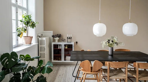
dining

A dining scene combining the two colours of black and white. The dining chairs are coordinated with four chairs that differ not only in colour but also in design, reducing monotony and adding variety to the space. The dining table has thin legs, giving it a clean impression that feels light rather than heavy. The black table is the centrepiece, but the flower vase placed by the window and the use of white lighting create a bright white feel in all directions, adding contrast to the space. (Photo: 101COPENHAGEN )
Storage

A storage scene unified in black. Wall-mounted storage leaves the floor open, so even though it's black, it doesn't feel oppressive or heavy, making the space feel spacious. The lattice-like, delicate design of the frame also gives it a translucent feel, creating a lighter impression. With movable shelves, you can vary the space by changing the position of the shelves, so even if you unify the same color, you can create contrast. Placing large parts such as drawers at the bottom will lower the center of gravity and make it easier to balance the space. (Photo: String )
kitchen

A clean, white-based kitchen scene. Storage that utilizes the wall allows you to feel color at eye level, making it easy to change the impression of the space. Placing frequently used dishes and seasonings within reach makes for a highly efficient kitchen space. You can also place your favorite interior items in the space, adding a personal touch to your housework space. (Photo: String )

Black-themed kitchens have become increasingly popular in recent years. While the large door area is black, the kitchen counters are gray, creating a gradation that reduces the weight and creates a stylish space. Adding white accents with small items, such as a tray on the counter, can help keep the space from becoming too monotonous and add some contrast. (Photo: 101COPENHAGEN )
Washroom

For bathrooms that want to give a clean impression, a white-based coordination is preferred. The bathroom, which is used by the whole family, is one of the scenes in the home where there are many things. Wall-mounted storage allows you to store the things you need neatly. The perforated metal shelves ensure ventilation, so towels and other items can be stored safely and cleanly. Hanging storage, combined with optional hooks, is also recommended. (Photo: String )
Bedroom

A bedroom that makes the most of the wall. By using wall-mounted storage, you can create a work space or a scene for collecting hobbies in a space-saving place such as beside the bed. Gray is used for the large bed, black is used for the storage/desk to add contrast, and white is used as an accent color for the accessories and the shelf above the bed, creating a well-balanced monotone coordination. Also, by combining the same black with matte and shiny accessories, the space is finished in a more distinct style. (Photo: String )
summary
What did you think of this monochrome interior made with Scandinavian items? It's recommended as an easy coordination to try, as it only requires combining three basic elements. White, gray, and black are also the three basic colors for furniture color variations, so they are relatively easy to choose and incorporate. Please take a look at the points we have listed and try to create a stylish and comfortable space.
Greenwich also offers free coordination consultations . Please feel free to contact us for monochrome interior coordination.
Public Relations: Okada